TARA PURI
Graphic Design & Art Direction
CONTRACT PROJECT 2024
Branded Cities x Conde Nast
CONTRACT PROJECT 2024
Umang
CONTRACT PROJECT 2024
Pasha: LOVO Chocolate
CONTRACT PROJECT 2024
Peddlar Report
CONTRACT PROJECT 2024
Infographs
CONTRACT PROJECT 2024
401 Newsletter
CONTRACT PROJECT 2024
Kome Yogurt
CONTRACT PROJECT 2024
3 in 1 Puzzle Cards
Kome Yogurt – Sign & Display Graphics
Tools: Adobe Photoshop, Adobe Illustrator
Roles: Research, Design, Seasonal Themes, User Experience
Year: 2023
DESIGN BRIEF
Toronto’s Kome Yogurt had already built a serene, Japanese-inspired identity. Clean lines, balanced palettes, calm simplicity. The challenge? Take this much-loved brand system and extend it—not reinvent it—through fixture signage and a tent card announcing a bold new flavor.
TASK
• Launch a Prouduct with definitive touch points
• Define Audience: Attract young adults and families
• Convert curiosity into sales with a $5.99 offer
Rather than reinventing, the goal was to expand the brand system. That meant studying Kome’s brand kit—its typography, palette, and tone—and designing new pieces that felt like a natural extension. Using a minimalist sans serif type treatment and balanced layouts, the signage preserved Kome’s calm, natural sensibility while introducing
FIXTURE SGNAGE
• Expanded the brand palette of orange, black, white, and green.
• Heroed a tilted cup of Lychee Yogurt, dome lid front-and-center, signaling freshness.
• Balanced minimal typography with eco-conscious cues—positioning the flavor as not just tasty, but responsible.
• Added a bold $5.99 callout + CTA, linking customers to online ordering and in-store discovery.
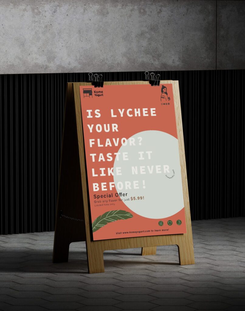
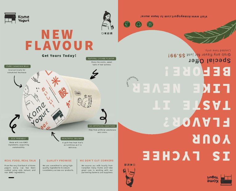
TENT CARD
• Front: “Is Lychee Your Flavor? Taste it Like Never Before!” — a headline built for intrigue.
• Supported by three icons: natural ingredients, no additives, trust.
• Back: Tilted yogurt cup, bold “New Flavor” stamp, arrows spotlighting benefits like locally sourced + non-GMO.
• Designed as a two-sided tool: one side invites, the other educates.
RESULT
Two simple formats became storytelling platforms.
• Consistent across signage + tent card, strengthening recognition.
• Converted casual foot traffic into first-time tasters.
• Reinforced Kome’s identity as clean, fresh, sustainable.
A launch that looked as natural as it felt.